The website is probably going to be the first thing people check out when considering visiting your church. That means it's a vital entry point for your ministry and you need to focus on how you communicate with people who visit your site. In fact, you should regularly evaluate how well your site is optimized for potential visitors.
I get it, regularly evaluating your church's website can feel like a lot of hassle, but here's a few keys to giving visitors a great first impression:
1. Focus on a clear first step for visitors
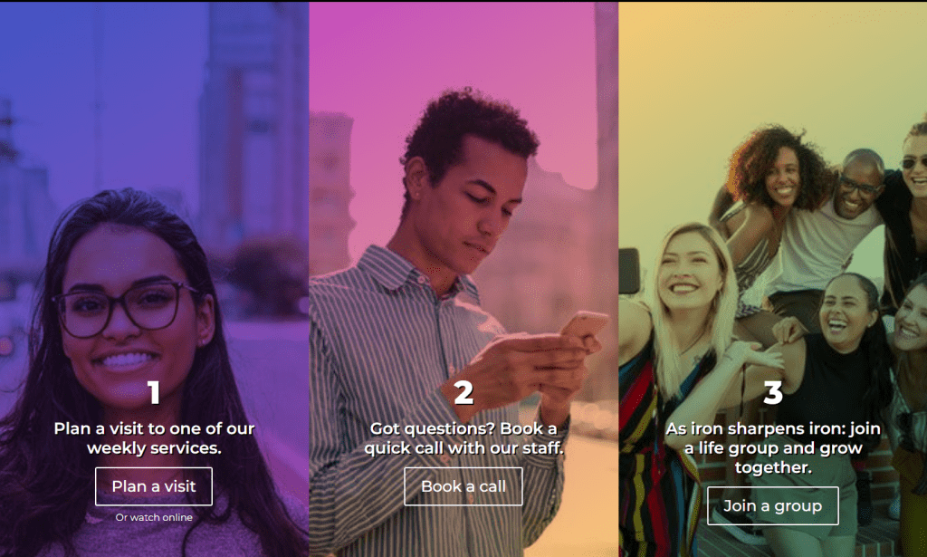
If a potential visitor to your church goes to your website, what action do you want them to take? Should they plan a visit? Should they watch a welcome video? Should they check out your YouTube channel? Try to focus on only one or two things at most that you want a visitor to do and add the appropriate buttons.
2. Do not use insider terminology

It's easy to end up with loads of acronyms and cryptic ministry names that only long-time members of a church understand. On your website, don't write ministry names like "Thirst" or "Ablaze," write names easily deciphered by non-members like "Youth Ministry" or "Young Adults."
3. Say less, show more
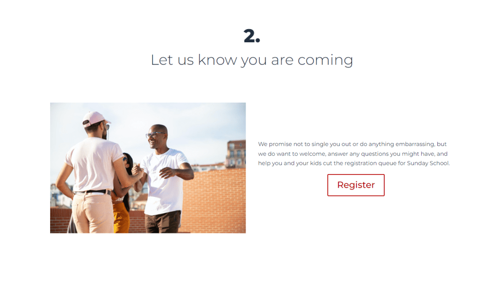
Most people don't really read websites. Instead, they tend to scan them for relevance first. Blocks of text are not helpful on most of your pages, instead you should keep your text short and direct. Think in bullet points and short sentences to communicate. The old adage is true "a picture says a thousand words" so your website should use pictures and short videos of real members from your church that communicate what you would otherwise write.
4. Make sure your website looks and works great on phones

Phones are becoming the primary way people interact with information. There's a roughly 80% chance the first time someone accesses your site it will be via their phone, so it needs responsive design to look and work great on phones and tablets.